Momentary Relapse With Jahmal Williams

MOMENTARY RELAPSE: JAHMAL WILLIAMS

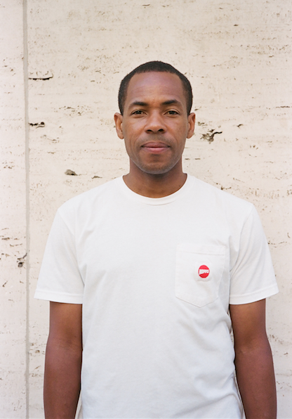
Jahmal Williams-Photo Stewart
It seems like with the multitude of new brands in the mix nowadays as well as the constant churning river of imagery we get bombarded with through social media, most board graphics don't hold a place in our hearts and minds the way that they used to. But, instead, it's the overall mystique and vibe that an art director creates with their brand's artwork that leaves that lasting impression.
Jahmal Williams has achieved a "feeling‚" with his brand that I think most skaters can identify as uniquely "Hopps‚". And he's done that not only with imagery and design but also with the heart and soul put into the team's skate footage and the video pieces they release. We caught up with Jahmal a while back to ask him his top 4 favorite board graphics that he's designed for Hopps and the following list is what resulted………enjoy:

-
Jahmal Williams: Drawing Series 1 and 2 Models
These two boards were inspired by my love of African Arts. During my years studying at the Museum of Fine Arts Boston I spent lots of time roaming through the museum admiring the diverse collection of art on display. At the time I was getting really into wood sculptures. The African sculptures section fascinated me and I decided to produce drawing studies of them. It was such a fun time sitting and staring at the colors, marks and shapes that defined each piece. The idea to use the drawings for HOPPS graphics didn't come until many years later. I felt these drawings translated to the composition of a skateboard deck very well.
-
Jerry Fowloer: Blocks Model
At the time when I designed this graphic for Jerry's pro model he had just mentioned to me that his wife was expecting a baby on the way. My son at the time was a couple years old and I was excited for Jerry in his new journey into fatherhood. I would laugh all the time about it because I knew he was going to have his hands full with baby things and I thought it would be funny to have toy blocks spelling his name out. I used my son's own toy blocks and worked out some of the details in Photoshop. I don't recall knowing that his wife was going to have twin girls because I probably would've altered the graphic a bit. This graphic was really special and fun to do.
-
Joel Meinholz: Milwaukee Model
This Meinholz board graphic was inspired by the fact that Joel is built tough and from Milwaukee. When I first put one and two together it was a beautiful match. The lightning bolt reminded me of Joel's energy and character. The "Meinholz‚" lettering worked really well for a skateboard deck. This is definitely one of my all time favorites because it gets the point across that I was trying to convey….built tough made in the USA.
-
Joel Meinholz: Mind Bender Model
Joel possesses a larger than life personality, which can't truly be described. Mind Bender is one of his aka names that somehow came about over the years. I don't know who coined it but it's so on the money. Joel isn't normal by any means and his free spirited outlook on life might be a key insight into his super human abilities. Joel had just started riding for HOPPS and we needed a graphic very fitting for him. I have always felt that the best board graphics have some hint into the rider's personality and gives the pro model board more character. Witnessing his ability of mind over matter in person is awesome and this board graphic I felt captured a bit of it.
0 comments